Axes
In this tutorial, we will learn various ways in which you can create different types of axis and customize them.
Formatting tick labels of the axis
You can create a custom tick format in axis using tickFormat attribute in axis configuration.
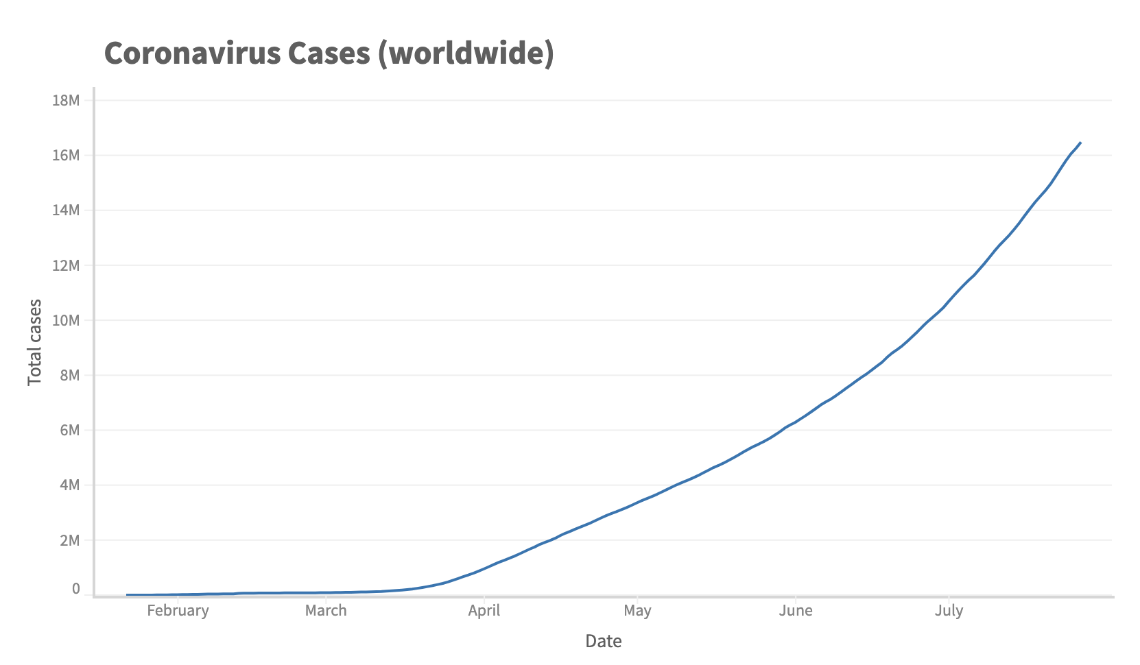
Let's see an example where you can format the numbers in thousand (K) or million (M).
First let's create function which returns the formatted value based on the number.
function numberFormat(num) {
  if (num >= 1000000) {
    return (num / 1000000).toFixed(1).replace(/\.0$/, "") + "M";
  }
  if (num >= 1000) {
    return (num / 1000).toFixed(1).replace(/\.0$/, "") + "K";
  }
  return num;
}
This function formats the number in thousand and million.
Now you need to set this function in tickFormat attribute of y axis configuration.
...
 .config({
    axes: {
        y: {
          tickFormat: numberFormat
        }
    }
...
});
const { muze, getDataFromSearchQuery, env } = viz;
const data = getDataFromSearchQuery();

function numberFormat(num) {
  if (num >= 1000000) {
    return (num / 1000000).toFixed(1).replace(/\.0$/, "") + "M";
  }
  if (num >= 1000) {
    return (num / 1000).toFixed(1).replace(/\.0$/, "") + "K";
  }
  return num;
}

muze
  .canvas()
  .config({
    axes: {
      x: {
        nice: false,
      },
      y: {
        tickFormat: numberFormat,
      },
    },
  })
  .data(data)
  .rows(["Cases"])
  .columns(["Date"])
  .title("Coronavirus Cases (worldwide)")
  .mount("#chart");
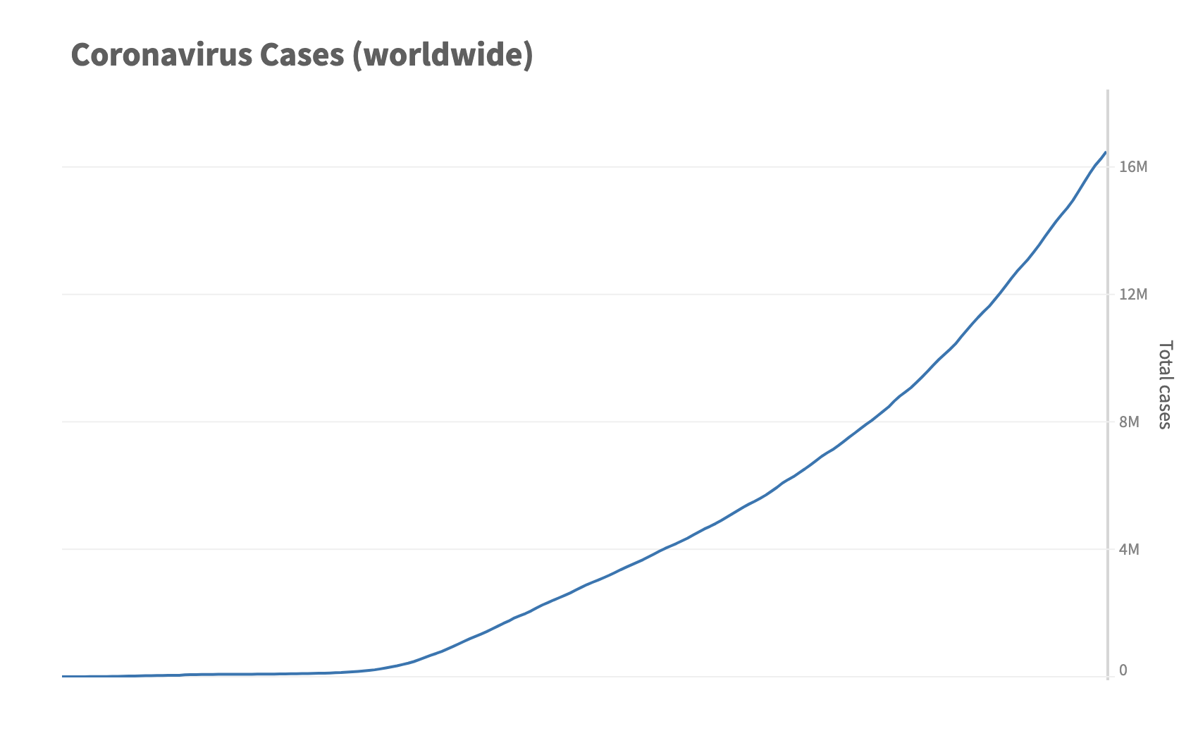
Changing the number of ticks in axis
You can also change the number of ticks in our previous example, using numberOfTicks atttribute.
const { muze, getDataFromSearchQuery, env } = viz;
const data = getDataFromSearchQuery();

function numberFormat(num) {
  if (num >= 1000000) {
    return (num / 1000000).toFixed(1).replace(/\.0$/, "") + "M";
  }
  if (num >= 1000) {
    return (num / 1000).toFixed(1).replace(/\.0$/, "") + "K";
  }
  return num;
}

muze
  .canvas()
  .config({
    axes: {
      x: {
        nice: false,
      },
      y: {
        numberOfTicks: 5,
        tickFormat: numberFormat,
      },
    },
  })
  .data(data)
  .rows(["Cases"])
  .columns(["Date"])
  .title("Coronavirus Cases (worldwide)")
  .mount("#chart");
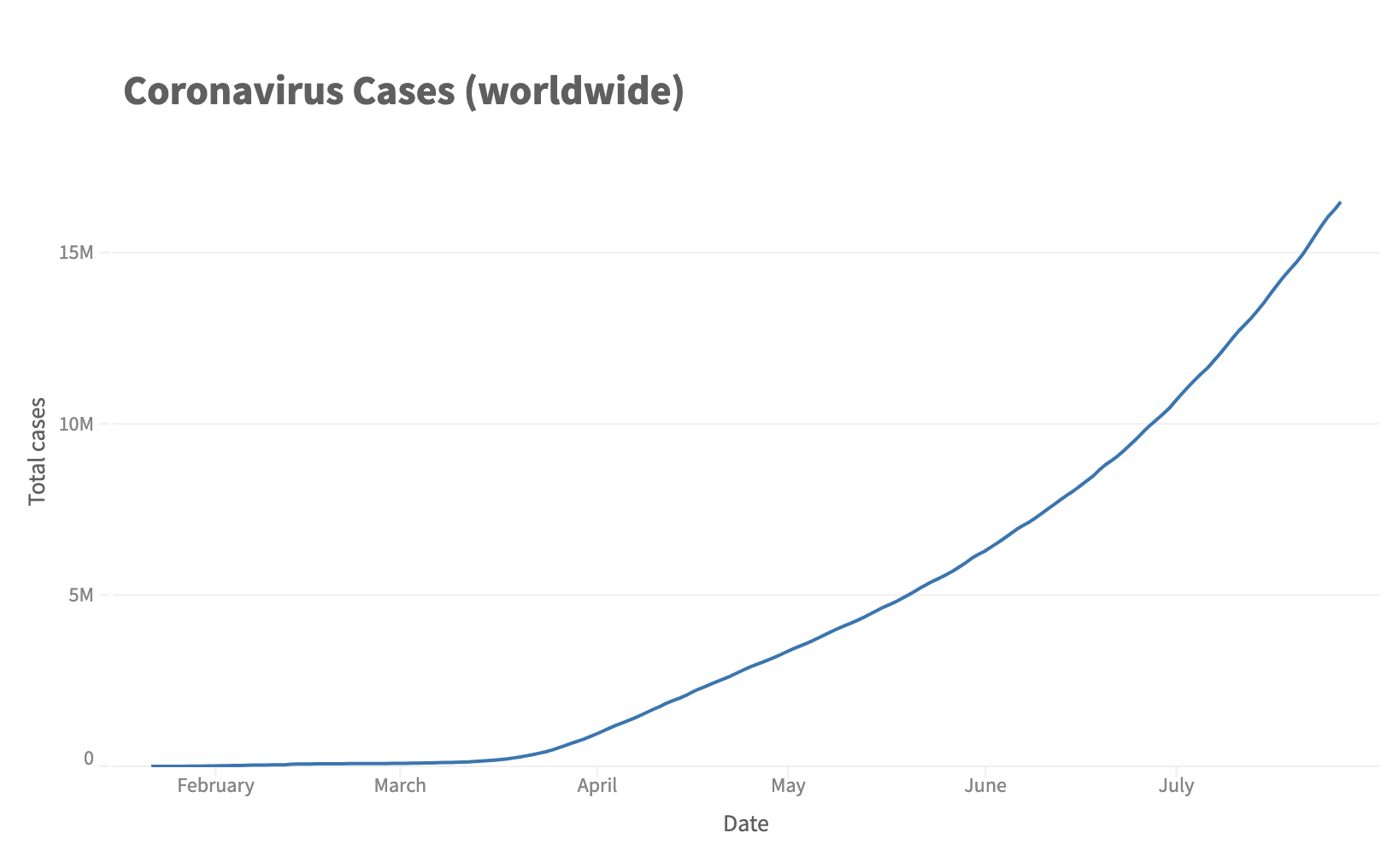
Note: numberOfTicks attribute is just a hint. The axis generates uniformly spaced ticks based on the domain. So, the actual number of ticks may be different.
Positioning axis
Y Axis can be positioned in left or right side of the chart and X Axis can be positioned in bottom or top of the chart.
You can do that by passing the y axis field in the second array of rows api.
This is how it can de done.
...
 .rows([[], ["Cases"]])
...
Rows api takes an array of arrays where the first array contains the fields which gets placed at the left side of the chart and the fields of the second array gets placed at the right side of the chart.
const { muze, getDataFromSearchQuery, env } = viz;
const data = getDataFromSearchQuery();

function numberFormat(num) {
  if (num >= 1000000) {
    return (num / 1000000).toFixed(1).replace(/\.0$/, "") + "M";
  }
  if (num >= 1000) {
    return (num / 1000).toFixed(1).replace(/\.0$/, "") + "K";
  }
  return num;
}

muze
  .canvas()
  .config({
    axes: {
      x: {
        nice: false,
      },
      y: {
        numberOfTicks: 6,
        tickFormat: numberFormat,
      },
    },
  })
  .data(data)
  .rows([[], ["Cases"]])
  .columns(["Date"])
  .title("Coronavirus Cases (worldwide)")
  .mount("#chart");
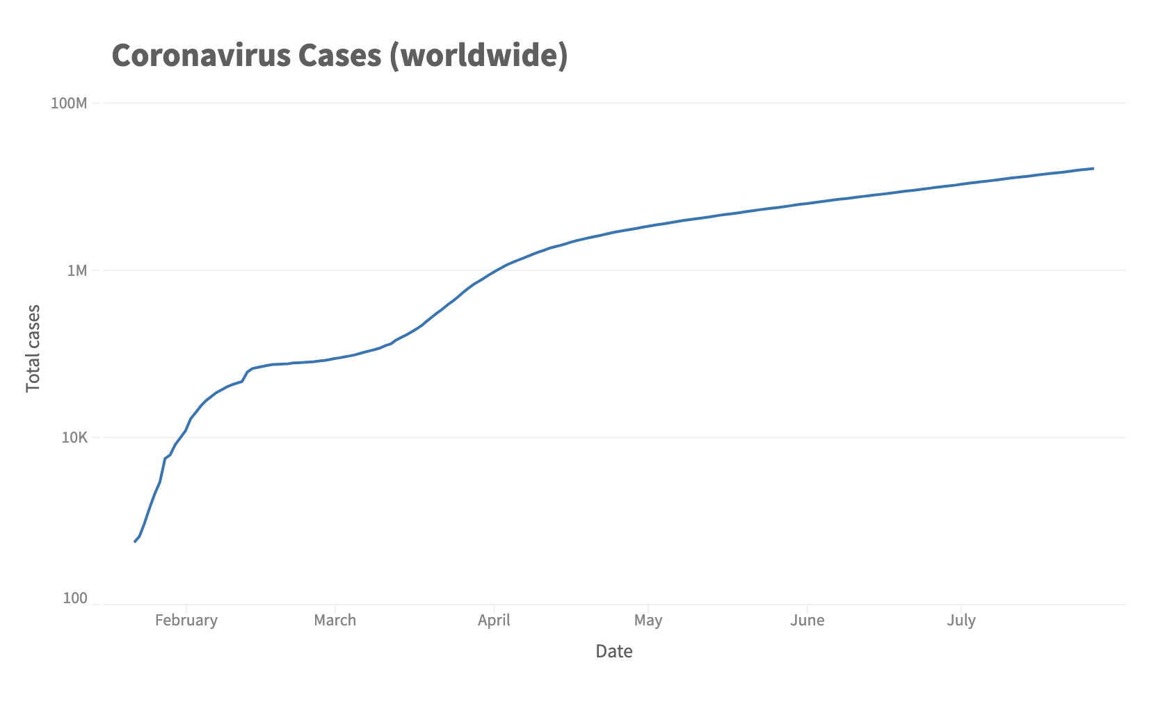
Creating a log axis
You can create a log axis in muze using interpolator attribute.
For this, you need to set interpolator as log in axis configuration.
...
    .config({
      y: {
        // Set interpolator to log for showing log axis
         interpolator: 'log'
       }
    });
...
const { muze, getDataFromSearchQuery, env } = viz;
const data = getDataFromSearchQuery();

function numberFormat(num) {
  if (num.rawValue >= 1000000) {
    return (num.rawValue / 1000000).toFixed(1).replace(/\.0$/, "") + "M";
  }
  if (num.rawValue >= 1000) {
    return (num.rawValue / 1000).toFixed(1).replace(/\.0$/, "") + "K";
  }
  return num.rawValue;
}

muze
  .canvas()
  .config({
    axes: {
      x: {
        nice: false,
      },
      y: {
        // Set interpolator to log for showing log axis
        interpolator: "log",
        numberOfTicks: 6,
        tickFormat: numberFormat,
      },
    },
  })
  .data(data)
  .rows(["Cases"])
  .columns(["Date"])
  .title("Coronavirus Cases (worldwide)")
  .mount("#chart");
Show / Hide the axis
Hide the axis using show attribute of axis.
...
 .config({
   x: {
     show: false
   }
 });
...
const { muze, getDataFromSearchQuery, env } = viz;
const data = getDataFromSearchQuery();

function numberFormat(num) {
  if (num.rawValue >= 1000000) {
    return (num.rawValue / 1000000).toFixed(1).replace(/\.0$/, "") + "M";
  }
  if (num.rawValue >= 1000) {
    return (num.rawValue / 1000).toFixed(1).replace(/\.0$/, "") + "K";
  }
  return num.rawValue;
}

muze
  .canvas()
  .config({
    axes: {
      x: {
        show: false,
        nice: false,
      },
      y: {
        numberOfTicks: 6,
        tickFormat: numberFormat,
      },
    },
  })
  .data(data)
  .rows([[], ["Cases"]])
  .columns(["Date"])
  .title("Coronavirus Cases (worldwide)")
  .mount("#chart");
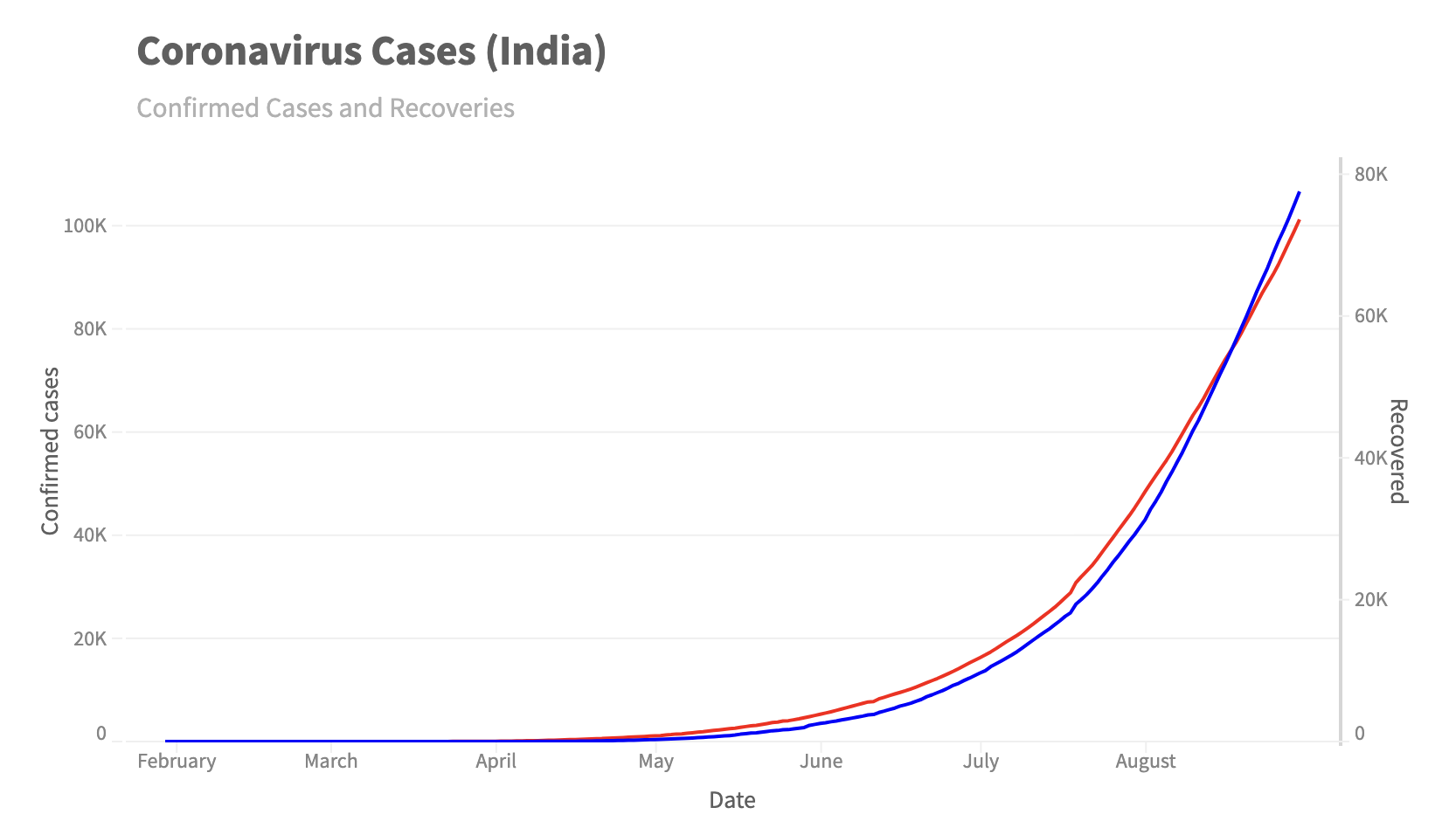
Dual axes
For creating dual axis, you need to pass multiple measures in rows.
...
 .rows([["Confirmed"], ["Cured"]])
...
Here, we have passed the Confirmed field in first array of rows and the Cured field in second array of rows. Hence, the Confirmed field of axis shows on the left side and Cured field shows on the right side.
When we add multiple measures in rows, we also need to tell Muze which of the layer will be assigned to which measure field.
Let's do that by adding layers in canvas and assigning y encoding field to each of these layers.
...
  .layers(
        [
            {
                mark: 'line',
                encoding: {
                y: 'Confirmed',
                color: {
                        value: () => 'red'
                    }
                }
            },
            {
              mark: 'line',
              encoding: {
                y: 'Cured',
                color: {
                    value: () => 'blue'
                }
              }
            }
        ]
    )
...
Here we have also added a color encoding value to each of these layers, otherwise the color of both layers will be same. The color encoding takes an object which has value attribute. The value attribute is a function which returns the color of the layer.
const { muze, getDataFromSearchQuery, env } = viz;
const data = getDataFromSearchQuery();

function numberFormat(num) {
  if (num.rawValue >= 1000000) {
    return (num.rawValue / 1000000).toFixed(1).replace(/\.0$/, "") + "M";
  }
  if (num.rawValue >= 1000) {
    return (num.rawValue / 1000).toFixed(1).replace(/\.0$/, "") + "K";
  }
  return num.rawValue;
}

muze
  .canvas()
  .config({
    axes: {
      x: {
        nice: false,
      },
      y: {
        numberOfTicks: 6,
        tickFormat: numberFormat,
      },
    },
  })
  .data(data)
  .rows([["Confirmed"], ["Cured"]])
  .columns(["Date"])
  .layers([
    {
      mark: "line",
      encoding: {
        y: "Confirmed",
        color: {
          value: () => "red",
        },
      },
    },
    {
      mark: "line",
      encoding: {
        y: "Cured",
        color: {
          value: () => "blue",
        },
      },
    },
  ])
  .title("Coronavirus Cases (India)")
  .subtitle("Confirmed Cases and Recoveries")
  .mount("#chart");
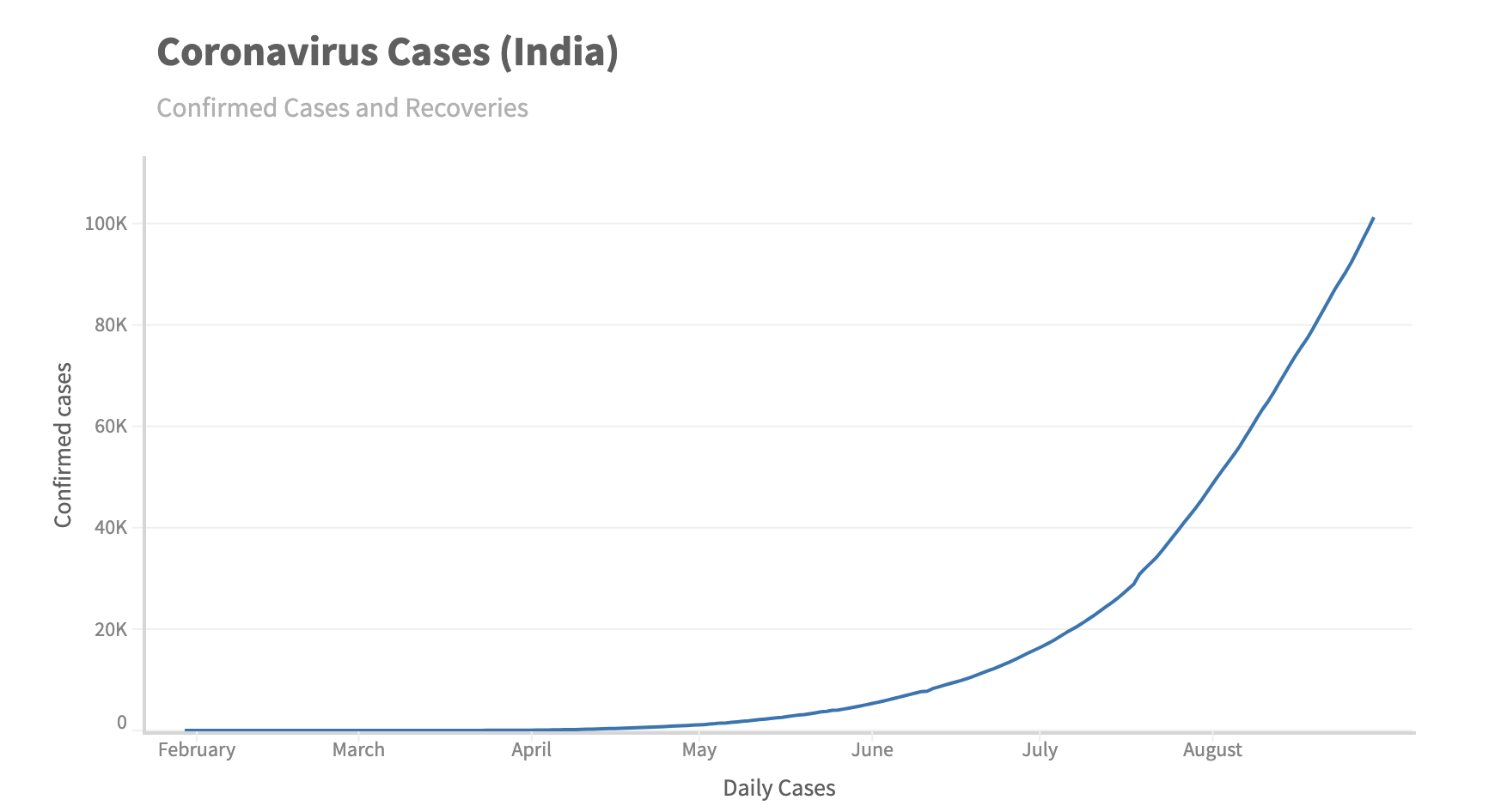
Changing / Hiding the display name of the axis
You can change the name of the axis using name attribute of axis.
...
 .config({
     axes: {
       x: {
            name: 'Daily Cases'
       }
     }
  });
...
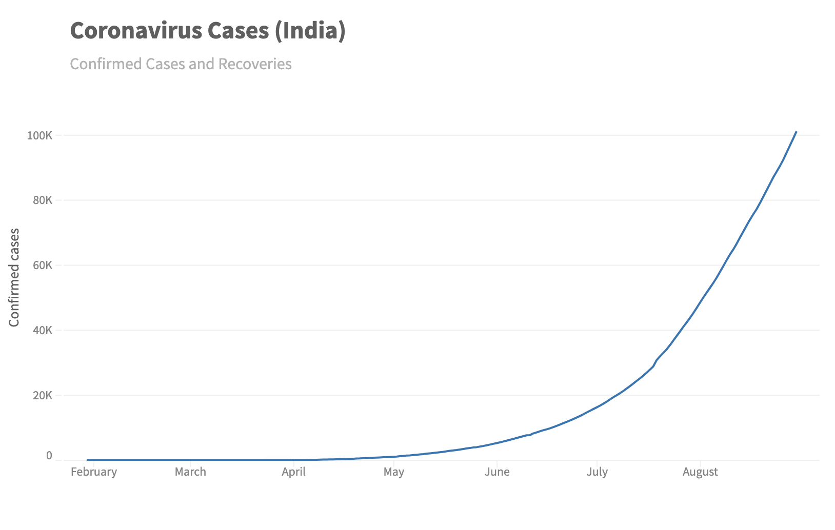
const { muze, getDataFromSearchQuery, env } = viz;
const data = getDataFromSearchQuery();

function numberFormat(num) {
  if (num.rawValue >= 1000000) {
    return (num.rawValue / 1000000).toFixed(1).replace(/\.0$/, "") + "M";
  }
  if (num.rawValue >= 1000) {
    return (num.rawValue / 1000).toFixed(1).replace(/\.0$/, "") + "K";
  }
  return num.rawValue;
}

muze
  .canvas()
  .config({
    axes: {
      x: {
        nice: false,
        name: "Daily Cases",
      },
      y: {
        numberOfTicks: 6,
        tickFormat: numberFormat,
      },
    },
  })
  .data(data)
  .rows(["Confirmed"])
  .columns(["Date"])
  .title("Coronavirus Cases (India)")
  .subtitle("Confirmed Cases and Recoveries")
  .mount("#chart");
Or, if you don't want to display the axis name, you can use the showAxisName attribute.
...
    config({
     axes: {
       x: {
         showAxisName: false
       }
     }
    });
...
const { muze, getDataFromSearchQuery, env } = viz;
const data = getDataFromSearchQuery();

function numberFormat(num) {
  if (num.rawValue >= 1000000) {
    return (num.rawValue / 1000000).toFixed(1).replace(/\.0$/, "") + "M";
  }
  if (num.rawValue >= 1000) {
    return (num.rawValue / 1000).toFixed(1).replace(/\.0$/, "") + "K";
  }
  return num.rawValue;
}

muze
  .canvas()
  .config({
    axes: {
      x: {
        nice: false,
        showAxisName: false,
      },
      y: {
        numberOfTicks: 6,
        tickFormat: numberFormat,
      },
    },
  })
  .data(data)
  .rows(["Confirmed"])
  .columns(["Date"])
  .title("Coronavirus Cases (India)")
  .subtitle("Confirmed Cases and Recoveries")
  .mount("#chart");
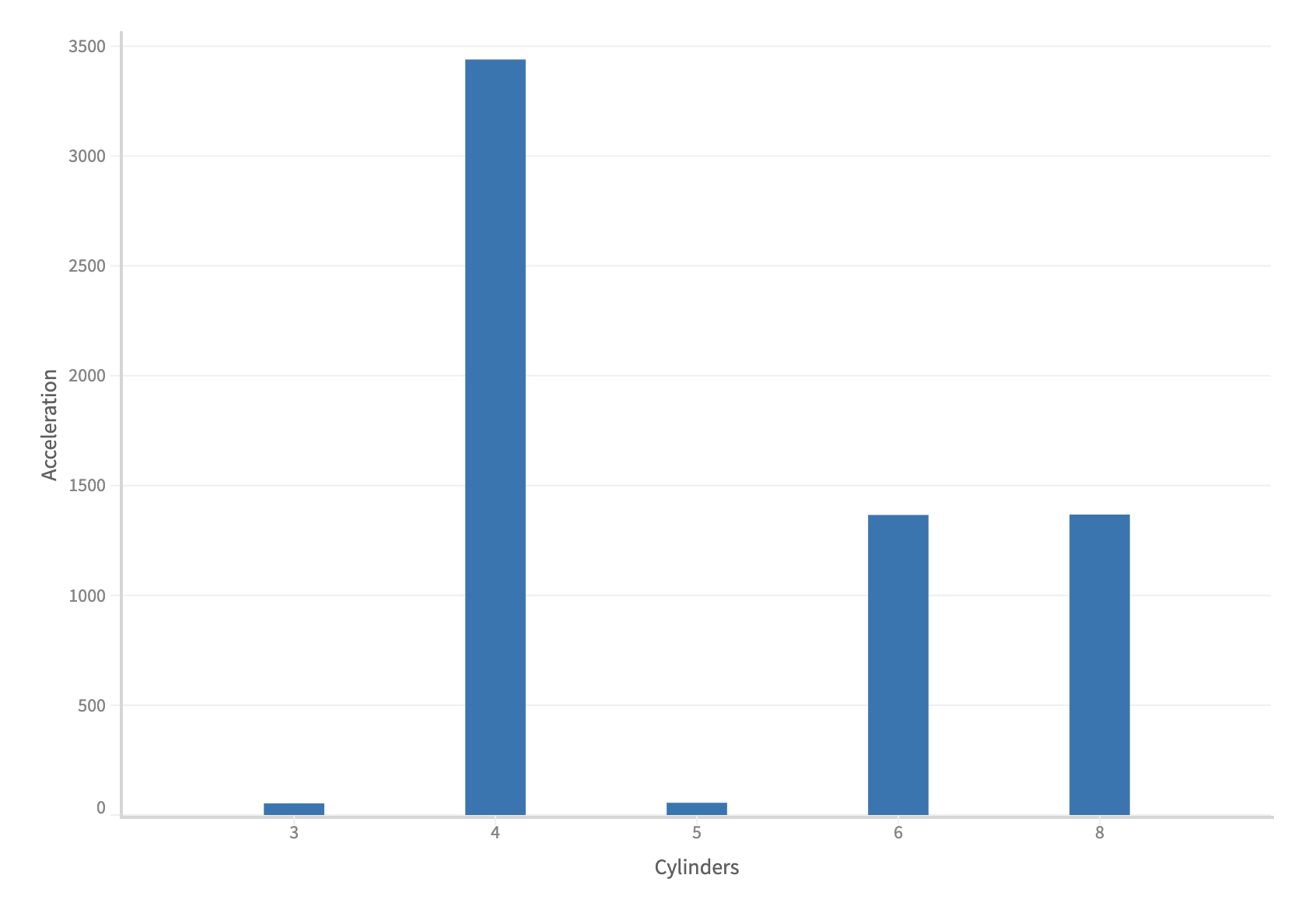
Controlling the padding of categorical axis
You can change the padding of a categorical axis in muze. The width of bars also changes due to this. It takes a value from 0 to 1, the more you increase it, the more the width of the bars gets reduced.
...
  .config({
      axes: {
        x: {
            padding: 0.7
        }
      }
   })
...
Note: If you want to change the width of bars, you can use padding property of axis to control the width.
const { muze, getDataFromSearchQuery, env } = viz;
const data = getDataFromSearchQuery();

muze
  .canvas()
  .data(data)
  .config({
    axes: {
      x: {
        padding: 0.7,
      },
    },
  })
  .rows(["Acceleration"])
  .columns(["Cylinders"])
  .mount("#chart");